Conversion rate optimisation – or CRO – is the process of identifying what you can do to improve the overall user experience and conversion funnel across all paid, earned and owned marketing assets.
In essence, it improves ROI without increasing your advertising spend…
Where to start?
Research Your Target Customer & Market
Understanding your customer and what makes them tick is the most fundamental step in improving conversion rates. Only by knowing your customers can you hope to convert them.
Optimisation is contextual, and conversion rates can vary widely depending on your offering, industry and location. This is why researching your industry and your niche (if you have one) is so important if you want to get a true understanding of what makes your target customers convert.
A good place to start is to conduct qualitative and quantitative research on your competitors’ websites. Do your competitors use multimedia content like video to illustrate their value proposition? Do they put customer testimonials front and centre? What does the user flow look like? Do they send people to landing pages or straight to the website homepage? What kind of posts are receiving the most engagement on social media?
Usability testing, or user testing, is also a great option to get real insights on how users interact with your product and website. You’ll often get invaluable data on how to improve aspects of your website or conversion funnel this way.
Demonstrate Value & Credibility Through Your Brand Presence
From initial research, you should gain a better understanding of what attracts a potential customer. It’s now a case of applying this knowledge towards optimising your online channels to suit the customers you’re trying to reach.
Start With Only The Most Relevant Keywords
It’s no secret that ad placement combined with audience intent is one of the most important factors affecting your conversion rate.
The best way to ensure that your ads are receiving the highest possible traction on Google Search is to create a list of “high-intent”, longer-tail keywords that are relevant to what you’re promoting and imply purchase intent. For example, rather than bidding on the term “surfing gear”, try “buy surfing shirt” or “cheap surfboard for sale”.
Some things to consider are:
- Study what competitors are bidding on with tools like SEMRush and SpyFu
- Think about targeting high intent mid and long-tail keywords – this will allow you to rank for the consumers who are more likely to convert.
- Make sure the keywords you’re targeting match what’s on the landing page.
- Think like a customer who’s in the market to buy, rather than who’s just looking for information.
Choose The Right Call-To-Action (CTA)
A call-to-action is exactly that – an instruction to take a desired action. If the result of that action doesn’t match what you instructed, you’re going to end up with confused and frustrated users who’ll soon lose their motivation to convert.
Always try to be as specific as you can with your CTAs – instead of ‘Buy Now’, why not, ‘Shop Now For Free Delivery’. Or if your desired reaction is to get someone to download an ebook, why not test ‘Download The Latest Trends Now’, instead of the vaguer ‘Learn More’.
Here are some good examples of CTAs that have been proven to work:
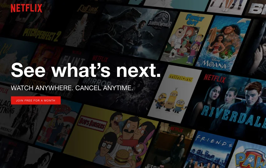
Netflix uses a CTA of ‘Join Free For A Month’ – this is effective as they are giving the user more detail about what they can expect to find out on the next page.
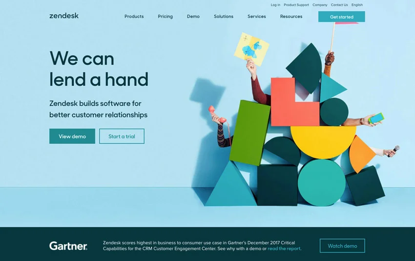
Zendesk uses two different CTA. The user can click ‘View More’ or ‘Start a Trial’, which gives them the option to either proceed to the next step in the conversion or learn more about the offer. Zendesk also use two different coloured buttons to demonstrate what the most desirable action is for the user to take
In addition to text, the way the CTA is present can have a huge impact. Performable, for example, found that changing their CTA button from green to red increased their conversions by 32.5%.
Create a Clickable Ad
For Google Search = use relevant keywords in your headline and don’t over complicate!
At this stage of the conversion cycle the main aim is to attract attention and invite the customer to the landing page, so make the headline as relevant to the search query as possible.
The next stage of the process is the landing page where the customer will go to find out more information and browse products, etc. The relevance between the keyword and the landing page needs to be crystal clear.
Make it easy for the consumer to reach the next stage of the conversion process by following through on the promises of the CTA.
For social media & display = use compelling images
It’s been proven, that replacing phoney stock images with pictures of real employees can increase conversions by 35%. Moreover, 67% of online shoppers also rate image quality as very important.
Unique imagery is effective in capturing consumer attention but it’s not as successful as using videos or moving images. With 64-85% of people more likely to purchase a product or service that has a video representation, it’s never been so important to take advantage of the storytelling and potential conversions available through using video.
Improve Landing Page and Website Design & Flow
Great images and great targeting can be totally undermined without a matching landing page. The landing page is where the user gains more information about your products and services, so it needs to be easy to navigate in order to obtain the most amount of conversions.
Continuity throughout the conversion funnel is key – from the ad to the website you must use a consistent design and message. If any of these are overtly different then it may give the user incorrect information about your brand.
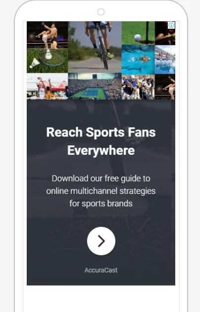
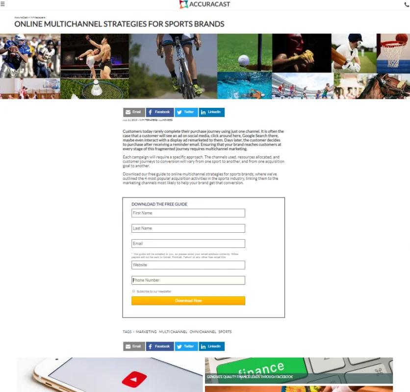
For example, below is an ad inviting the consumer to download a whitepaper, so the landing page includes a form and provides instructions on the download.
The same images used on the ad are present on the landing page:
Optimise the Contact Form
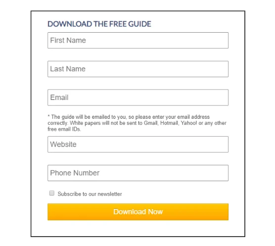
Optimising contact form fields has been proven to also be beneficial to conversion rates. Think of it this way: asking for 4 pieces of data is going to take up less than 30 seconds whereas 10+ fields could take well over a minute to go through.
Don’t create unnecessary work for your customer and keep your form fields short and sweet. For example, Imaginary Landscape LLC reduced its 11-field form to a 4-field form, and this increased their conversions by 160%!
Finally… test, test, TEST!
It’s important to make sure the conversion funnel works. Testing it will help to identify issues and allow you to gain the same experience your customer will receive which can allow you to optimise and make improvements if necessary.
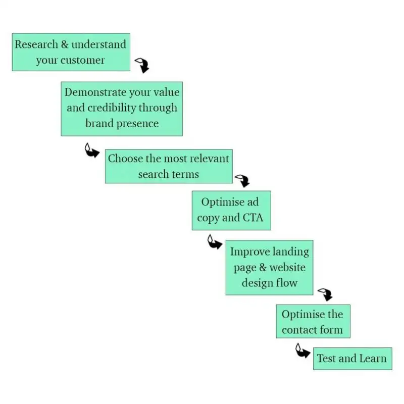
So to sum up…
About the Author
Suzie is a Google advertising specialist and freelances as an artist. Experienced content creator with a demonstrated history of working within content marketing and paid advertising.


